

A thoughtful typographic hierarchy
This reference guide breaks down the theme’s core typographic engine: from the 5 fluid font scales and matching heading styles, CSS custom properties, document outline checks, and curated modern system font stacks ready to use.
Table of contents
Headings or custom font sizes — when to use what?
Headings communicate structure and outline
The title of the post is normally used as Heading Level 1 automatically. There should only be one H1 on each post, so don’t insert H1‘s.
Dividing larger sections of text into smaller bits, each given a meaningful Heading 2, can be very helpful to any user, quickly skimming the content. Maybe even consider H3 and H4, but further branching is rarely helpful.
You should use headings to convey structure, not style. A call-to-action in the middle of the page, should probably start with an H2, not an H1. If you want to make it larger to draw attention to it, that is what the font-size is for.
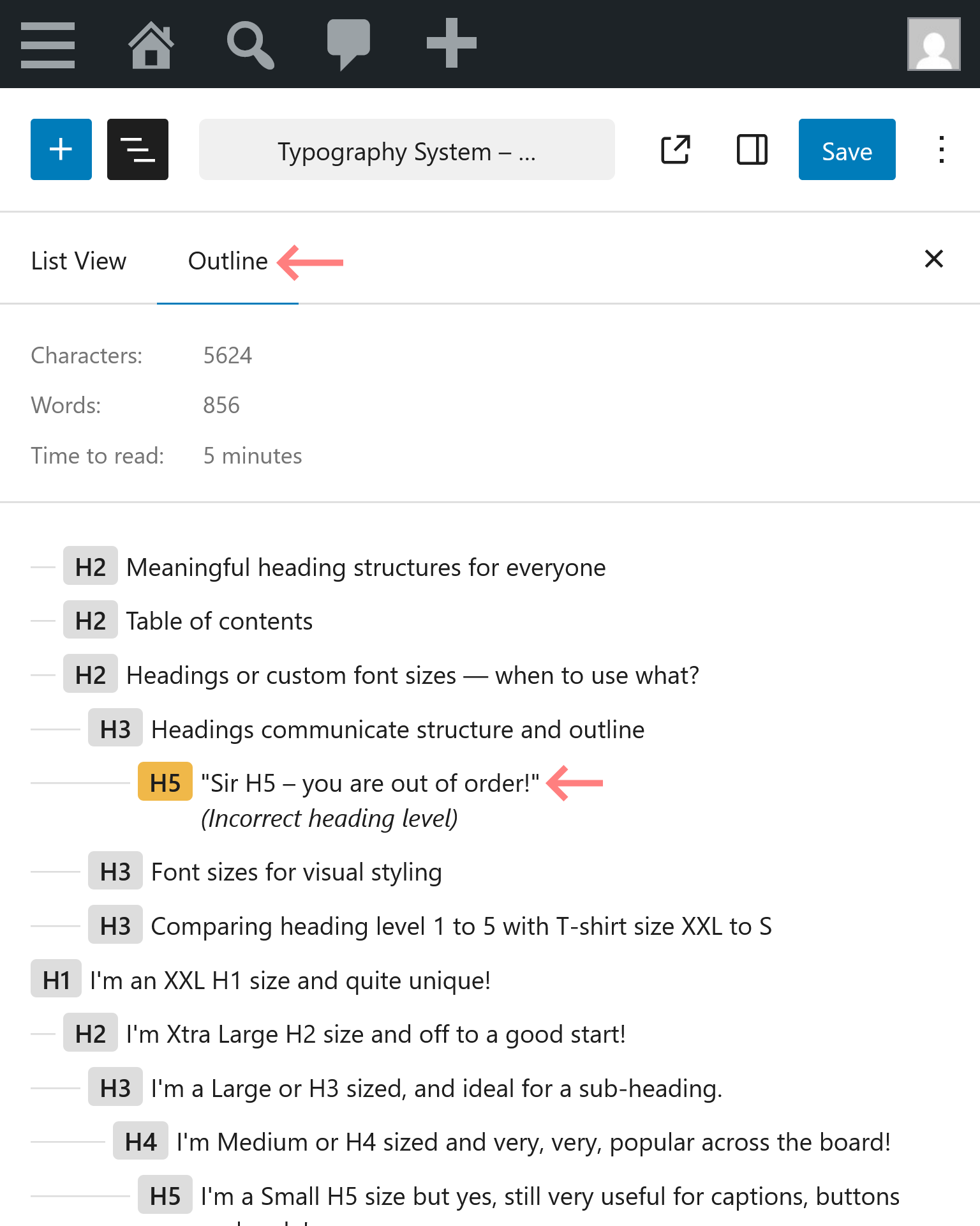
Outline – part of the List View
The List View is indispensable when creating content in the block editor that extends beyond a few paragraphs of text.
But did to know that the List View has a second tab, outlining all the headings, just like in your word processor?
Incorrect heading levels are highlighted orange and in text. Click the heading to move your cursor to it, and fix it.
Font sizes for visual styling
You should normally stick to the sizes defined by the theme. However, when you need that a smaller or larger text to draw attention to something, you can pick one of 5 ‘T-shirt’ font sizes in a block’s typography panel.
Comparing heading level 1 to 5 with T-shirt size XXL to S
Below are samples of Heading level 1 (the largest) to level 5 (the smallest) compared to the corresponding paragraph T-Shirt size XXL to S.
Font sizes are available for custom CSS
WordPress generates custom properties that are referenced in the customizer to ensure consistent font-sizes across the site in both Blocksy and Block Editor produced output. These properties should be used for any custom CSS as well.
The following list shows what CSS custom properties is being for the different HTML elements in the customizer, and the associated T-shirt size.
| HTML element | T-shirt | WordPress CSS Custom Property |
|---|---|---|
| BASE | M | –wp–preset–font-size–medium |
| H1 | XXL | –wp–preset–font-size–xx-large |
| H2 | XL | –wp–preset–font-size–x-large |
| H3 | L | –wp–preset–font-size–large |
| H4 | M | –wp–preset–font-size–medium |
| H5 | S | –wp–preset–font-size–small |
| Buttons | S | –wp–preset–font-size–small |
| Quote | M | –wp–preset–font-size–medium |
| Figcaption | S | –wp–preset–font-size–small |
Custom fonts and common usecases
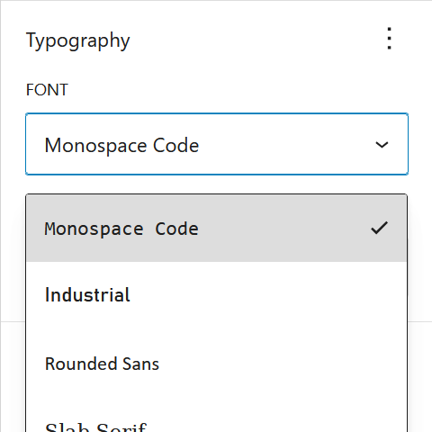
Standard fonts for headings and body text are defined in the customizer, but there are cases where a custom font supports the message better. An example is Monospace Code that works well for pricing tables and opening hours.
Typography resources and credits
Modern Font Stacks and how to enable them
Modern Font Stacks
System font stack CSS organized by typeface classification for every modern OS. The fastest fonts available. No downloading, no layout shifts, no flashes.
Blocksy Pro, Custom Fonts extension
Extension that allows you to enable Modern Font Stacks and upload and use your own WOFF2 fonts, integrating them with both Blocksy and Gutenberg.
Full Site Editing theme.json typography
Learn how to use theme.json to add font families to your WordPress theme and how to assign different font families to different blocks.
Responsive Typography
Fluid type scale calculator at Utopia
Calculate font size values in px for your type scales at the min and max viewport widths. These font sizes can be added to theme.json.
Full Site Editing – theme.json fluent typography
Learn how to se a typography scale to reduce or increase the font size depending on the browser window width using CSS clamp().