
Table of Contents
- Text
- Heading blocks /h I’m Xtra Large H2 size and off to a good start!
- I’m a Large or H3 sized, and ideal for a sub-heading. I’m Xtra Large H2 size and off to a good start!
- I’m a Large or H3 sized, and ideal for a sub-heading.
- List blocks /l
- Quote /q
- Code /c
- Details /d
- Preformattet /pr
- Pullquote /pu
- Table /t
Text
Paragraph Blocks
The Paragraph block is a basic building block that allows you to add text content to a post or page. It is the default block that appears when you create a new post or page.
Besides adding text, the Paragraph block offers various formatting options to customize text content. It lets you make the text bold, italics, and strikethrough. Some examples and their keyboard shortcuts below:
Bold Ctrl+B
The HTML <strong> element indicates that its contents have strong importance, seriousness, or urgency. Browsers typically render the contents in bold type.
Italic Ctrl+I
The <em> HTML element marks text that has stress emphasis. The <em> element can be nested, with each level of nesting indicating a greater degree of emphasis.
Link Ctrl-K
The <a> HTML element (or anchor element), with its href attribute, creates a hyperlink to web pages, files, email addresses, locations in the same page, or anything else a URL can address.
Highlight
The <mark> HTML element represents text which is marked or highlighted for reference or notation purposes due to the marked passage’s relevance in the enclosing context.
Inline Code Shift + Alt + X
The <code> HTML element displays its contents styled in a fashion intended to indicate that the text is a short fragment of computer code. By default, the content text is displayed using the user agent’s default monospace font.
Keyboard Input
The <kbd> HTML element represents a span of inline text denoting textual user input like tab or enter from a keyboard, voice input, or any other text entry device.
Strikethrough Shift + Alt + D
The <s> HTML element renders text with a strikethrough, or a line through it. Use the <s> element to represent things that are no longer relevant or no longer accurate.
Subscript
The <sub> HTML element specifies inline text which should be displayed as subscript for solely typographical reasons. Subscripts are typically rendered with a lowered baseline using smaller text, like: C8H10N4O2 aka “caffeine.”
Heading blocks /h
Heading Block (vs same size Paragraph — Transitional)
Headings level H1 to H5
Paragraphs size XXL to S
I’m an XL H1 size and quite unique!
I’m an XL H1 size and quite unique!
I’m Xtra Large H2 size and off to a good start!
I’m Xtra Large H2 size and off to a good start!
I’m a Large or H3 sized, and ideal for a sub-heading.
I’m a Large or H3 sized, and ideal for a sub-heading.
I’m Medium or H4 sized and very, very, popular across the board!
I’m Medium or H4 sized and very, very, popular across the board!
I’m a Small H5 size but yes, still very useful for captions, buttons and code!
I’m a Small H5 size but yes, still very useful for captions, buttons and code!
Heading Block (vs same size Paragraph — Humanist)
Headings level H1 to H5
Paragraphs size XXL to S
I’m an XL H1 size and quite unique!
I’m an XL H1 size and quite unique!
I’m Xtra Large H2 size and off to a good start!
I’m Xtra Large H2 size and off to a good start!
I’m a Large or H3 sized, and ideal for a sub-heading.
I’m a Large or H3 sized, and ideal for a sub-heading.
I’m Medium or H4 sized and very, very, popular across the board!
I’m Medium or H4 sized and very, very, popular across the board!
I’m a Small H5 size but yes, still very useful for captions, buttons and code!
I’m a Small H5 size but yes, still very useful for captions, buttons and code!
List blocks /l
Organizing content into lists has just gotten easier. You can use the List Block to create a bulleted or numbered list. In order to add a List Block, click on the add block button and select the List Block.
Unordered lists
The <ul> element is for grouping a collection of items that do not have a numerical ordering, and their order in the list is meaningless. Typically, unordered-list items are displayed with a bullet, which can be of several forms, like a dot, a circle, or a square.
- Lorem ipsum dolor sit amet, consectetur adipiscing elit.
- Vestibulum pulvinar arcu id eleifend eleifend.
- Suspendisse eu turpis nec magna semper lacinia.
- Nullam sit amet arcu finibus nibh consectetur aliquam
- Phasellus eget massa fermentum, interdum lectus ac
- Sed vestibulum tortor et aliquet sodales.
Ordered lists
The <ol> HTML element represents an ordered list of items — typically rendered as a numbered list.
- Lorem ipsum dolor sit amet, consectetur adipiscing elit.
- Vivamus lacinia magna eu maximus blandit.
- Nam eget orci ullamcorper, auctor dui sit amet
- Phasellus at nibh a arcu aliquam ultricies ut at neque.
- Curabitur vitae metus laoreet, egestas massa vel
- Nulla elementum lectus id est scelerisque, et consectetur.
Quote /q
Use the Quote block to easily add a quote to any post or page. Adding quotes can help you highlight great reviews from your audience or phrases that inspire you.
To add the Quote block to a page, click the block inserter (+) to open the block inserter pop-up window and choose the Quote block.
Quote block documentation
Click on the Transform button to convert the Quote block into another block type using the existing content.
You can transform the Quote block into a Paragraph, Columns, Group, or Pullquote block. You can also change the style of the Quote block from Default to Plain.
Quote block documentation
Using the alignment drop-down from the toolbar, you are able to align the Quote block to the left, make it center-aligned, or align it to the right.
Code /c
Code block lets you add and display code snippets for others to view. To add the Code block, open the block inserter by clicking the (+) icon in the upper left corner of the editor. After that, look for Code using the search bar and click it to insert the block into the editor.
/***
 * For 'real 'external links, links that open in a new windows
 * (don't), and links pasted into the block editor, append a
 * simple base 64 encoded external link symbol (but skip images)
 **/
a:is([rel*="external"], [target="_blank"], [data-type="link"]):not(:has(svg, img))::after {
    background-color: currentColor;
    display: inline-flex;
    content: "";
    width: 0.6em;
    height: 0.6em;
    margin-left: 0.2em;
    margin-right: 0.2em;
    mask-size: cover;
    mask-image: url("data:image/svg+xml;base64,PHN2ZyB4bWxucz0naHR0cDovL3d3dy53My5vcmcvMjAwMC9zdmcnIGZpbGw9J25vbmUnIHZpZXdCb3g9JzAgMCAxNiAxNic+PHBhdGggZmlsbD0nI2ZmZicgZD0nTTEuNSAzLjV2MTFoMTFWMTBIMTR2NWMwIC42LS40IDEtMSAxSDFhMSAxIDAgMCAxLTEtMVYzYzAtLjYuNC0xIDEtMWg1djEuNUgxLjVaJy8+PHBhdGggZmlsbD0nI2ZmZicgZD0nTTE2IDEuMiA3IDEwIDYgOWw4LjktOSAxIDFaJy8+PHBhdGggZmlsbD0nI2ZmZicgZD0nTTcuNSAwSDE2djEuNUg3LjVWMFonLz48cGF0aCBmaWxsPScjZmZmJyBkPSdNMTYgMHY4LjVoLTEuNVYwSDE2WicvPjwvc3ZnPiA=");
}
Note: If syntax highlighting like Prism is enabled, add the class lang-css to the Code block for dark mode compatible syntax highlighting. Other languages supported are HTML, PHP, and Apache HTACCESS.
Details /d
The Details block displays a text summary and an arrow button: When you click on the text or the button, the block opens and reveals additional content on the page.
This block provides a way to show or hide content on your site. This can be useful on FAQ pages, showing and hiding detailed event information etc.
Customize the summary — replace the placeholder with your text.
The Summary is customizable by selecting the “Write summary…” placeholder text and adding your own text. By default, the block uses the summary content as its label, similar to how the heading block works.
Content inside the details block are hidden
The additional content are blocks that you place inside the Details block that are hidden until you click on the summary text. Because the content is hidden until you open the block, it is referred to as “hidden content”.
Accessibility tip: use only plain text in summaries
For best accessibility, use only plain text in details summaries—avoid adding links or buttons, as they can confuse users of assisting technologies and may not expand the hidden content as expected.
How to only open one detail element at a time
Identical name attributes of the summary element, enables multiple Details blocks with the same name attribute to be connected, with only one open at a time. In this demo here, we use the name attribute: tips
Preformattet /pr
If you wish to add text to a post or page that is displayed exactly as you type it, the Preformatted Block is for you. You can create one by clicking the Block Inserter icon.
Preformattet can be used for ASCII Art, but be careful about accessibility, the WordPress Preformattet block does not offer a figcaption element.
       _    ____   ____ ___ ___      _         _
      / \  / ___| / ___|_ _|_ _|    / \   _ __| |_
     / _ \ \___ \| |    | | | |    / _ \ | '__| __|
    / ___ \ ___) | |___ | | | |   / ___ \| |  | |_
   /_/   \_\____/ \____|___|___| /_/   \_\_|   \__|
Preformattet block documentation
Pullquote /pu
If you want to add emphasis to a piece of text in your post or page, the pullquote block can quickly and easily make short snippets look beautiful.
To add one, click the Block Inserter icon when editing your post or page.
Pullquote block documentation
You can also quickly add one by typing /pullquote in a blank paragraph block and then hitting the enter key.
Table /t
Use the Table block to easily create a table in any post or page. To add the Table block to a page, click the Add block button to open the block inserter pop-up window and choose the Table block.
| Day of week | Daily deal | Opening hours |
|---|---|---|
| Monday | Apples | 08–16.00 |
| Tuesday | Bananas | 08–17.30 |
| Wednesday | Oranges | 09–13.30 |
Use the edit table option to quickly manage rows and columns. It’s possible to insert a row or column before, insert a row or column after, and delete a row or a column.
Media
Image /i
The image block can be added to a page by clicking on the Add Block button. Alternatively, you can type /image and press enter. The media options panel will load with three options, Upload, Media Library, and Insert from URL.
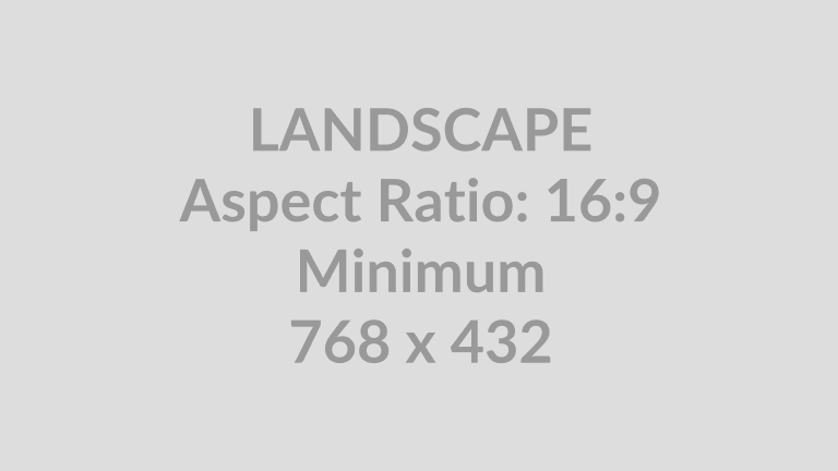
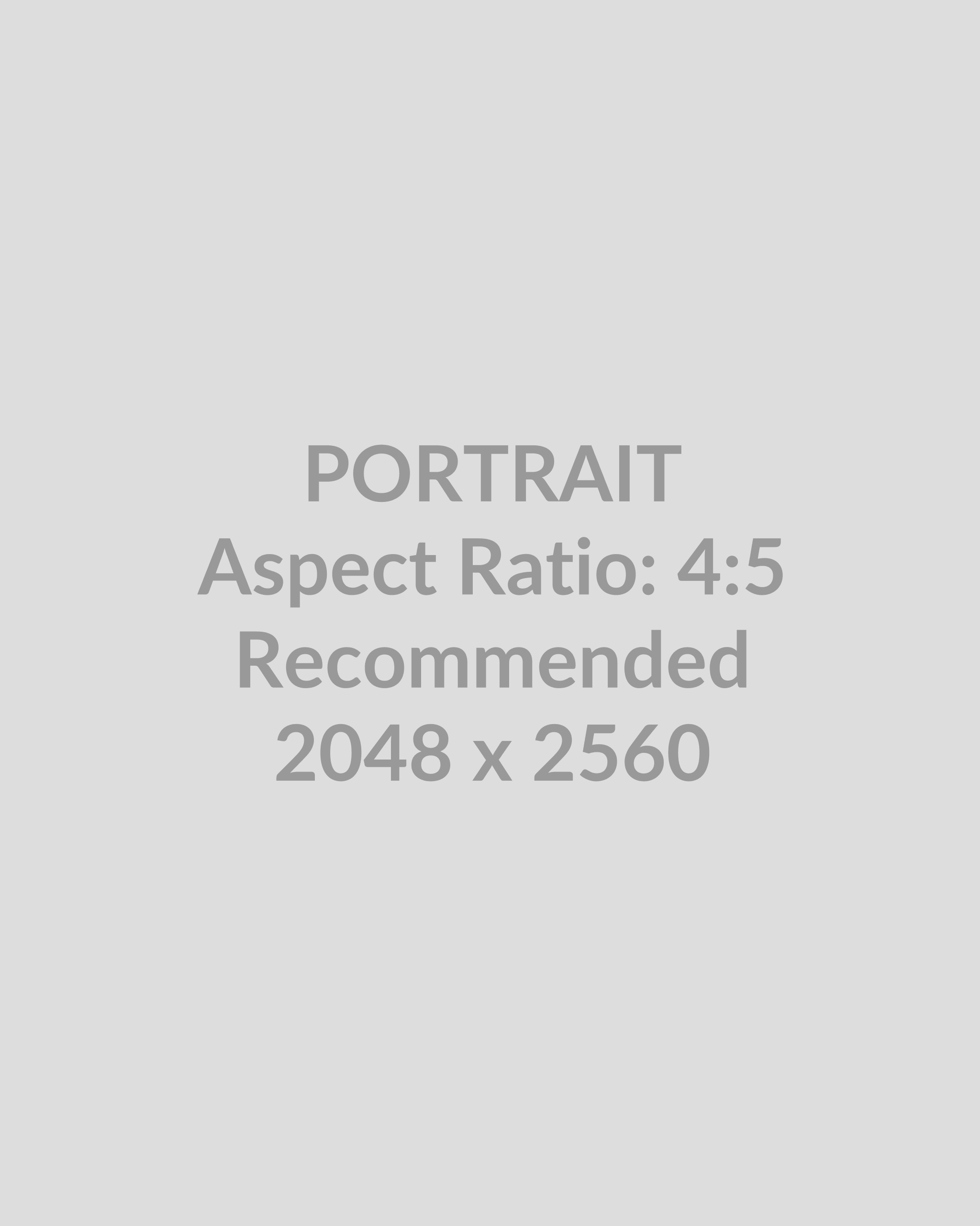
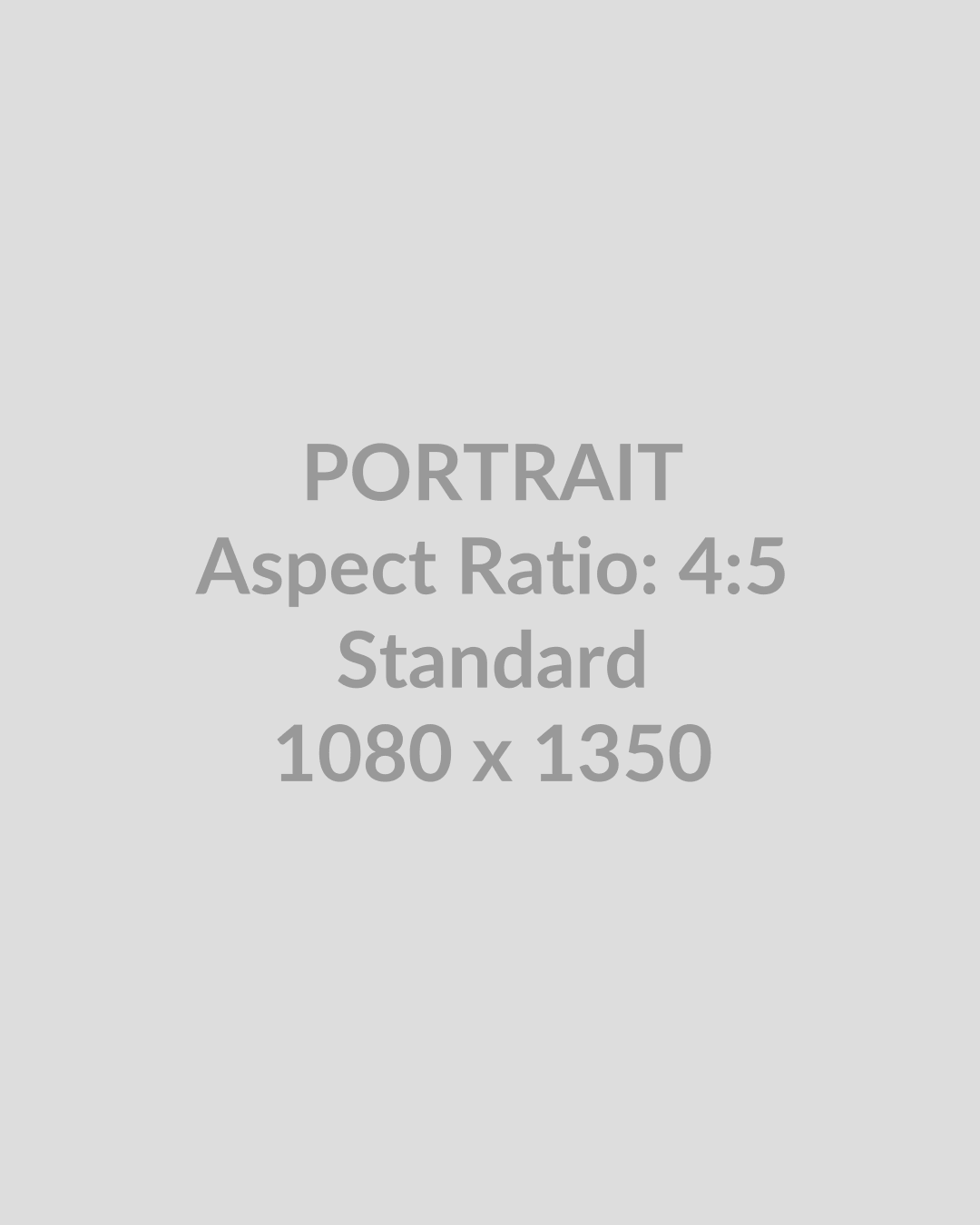
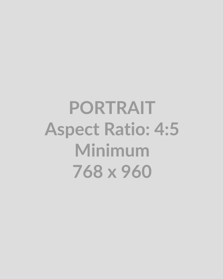
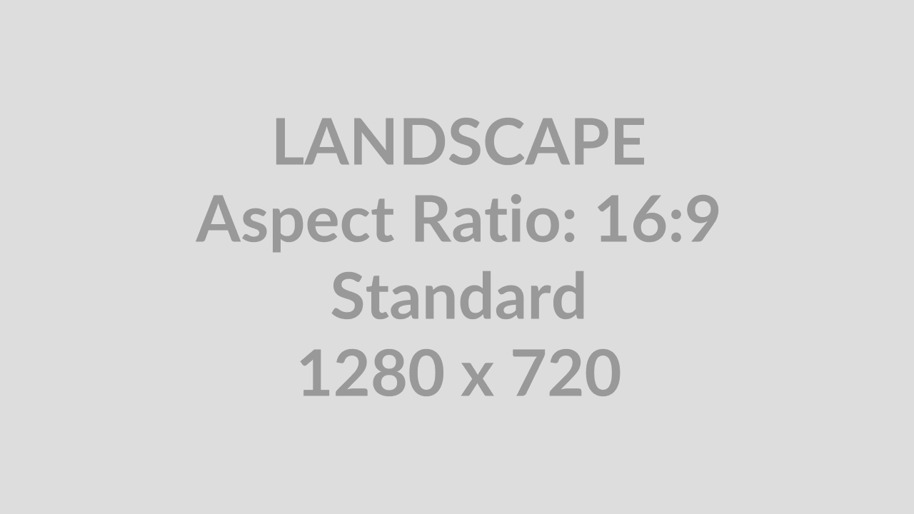
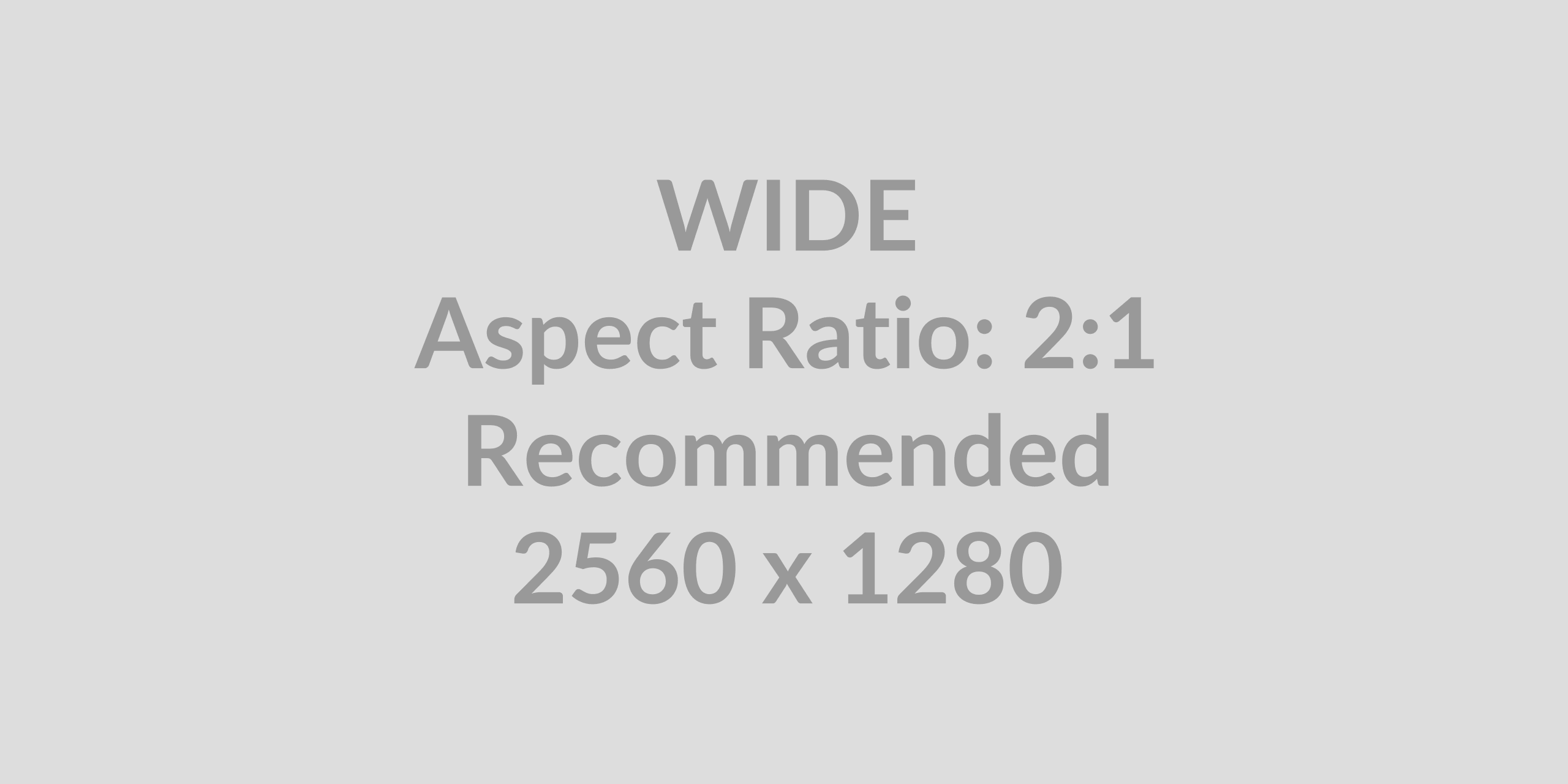
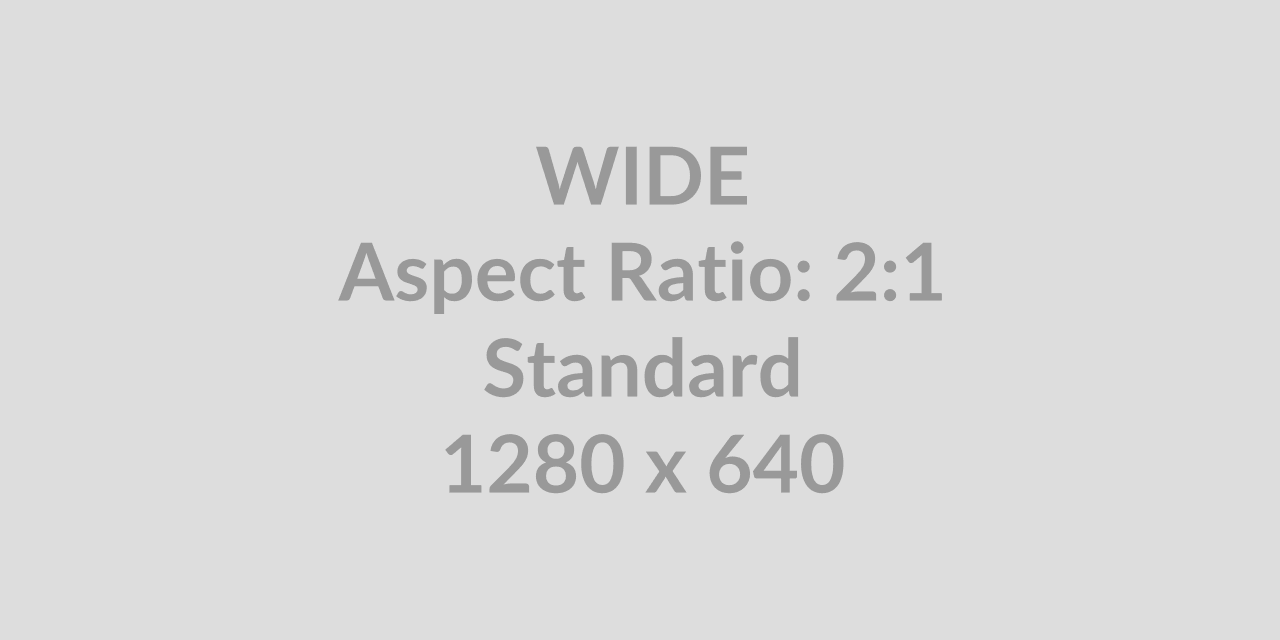
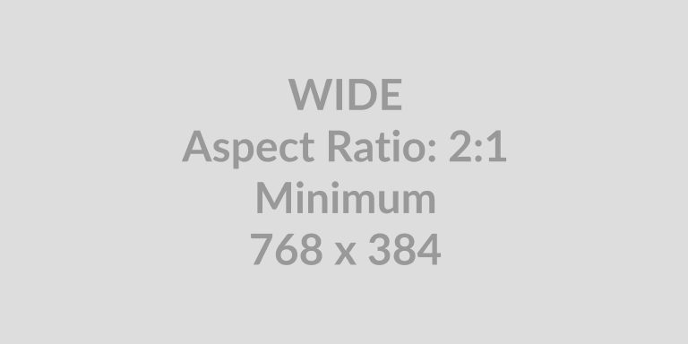
Image placeholders
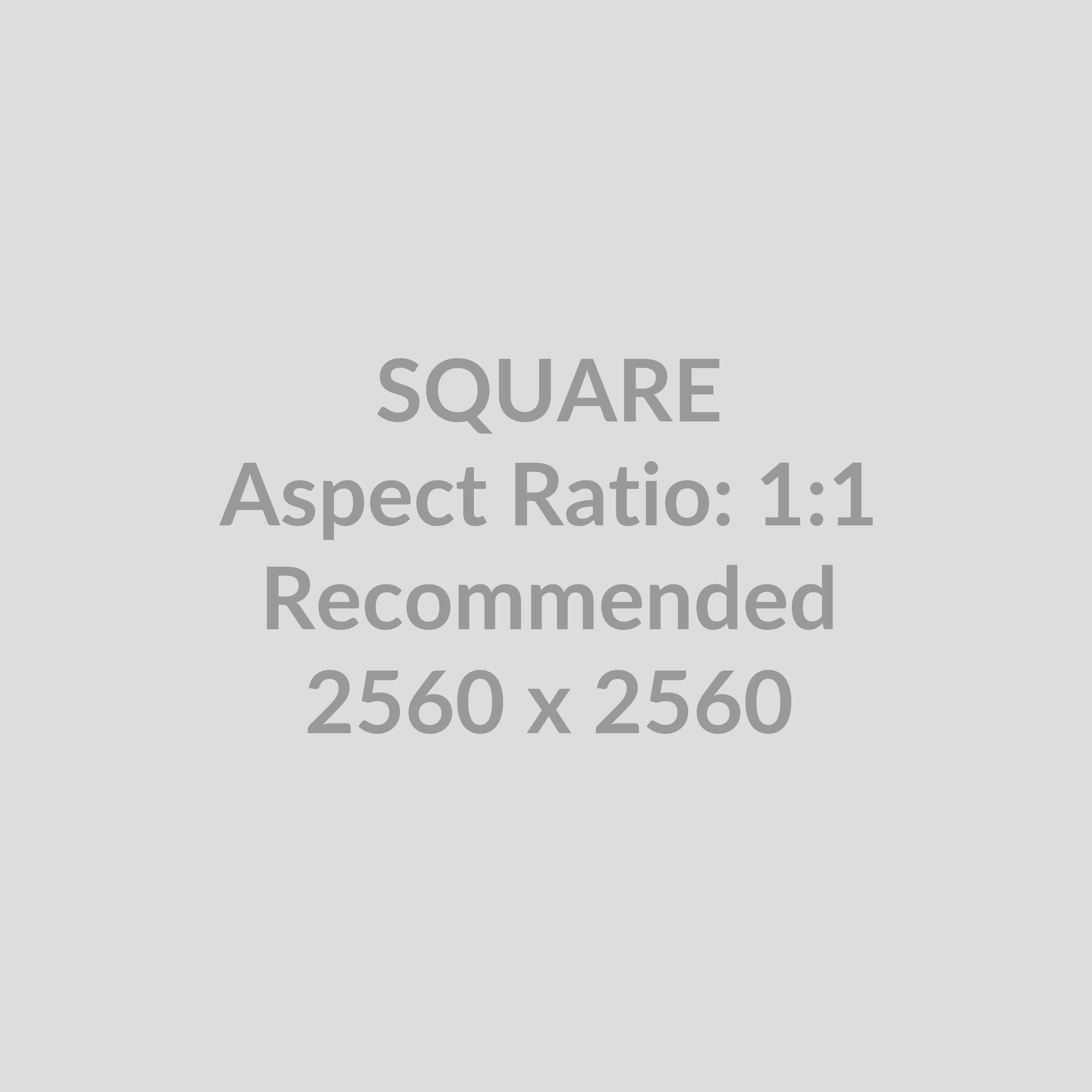
The boho assets folder /assets/placeholders contains examples of images in recommended aspect ratios and resolutions. Here is an example:
Logo placeholders
The boho assets folder /assets/logos/ contains sample logos in SVG with the filenames logo-placeholder-01.svg – 12.svg
Gallery /ga
The Gallery block allows you to easily add multiple photos and automatically arrange them in a gallery. You can control the number of columns and the size of the images in the gallery.
The Gallery block can be added to a page by clicking on the Block Inserter (+) icon and selecting the Gallery block.
You can transform or change the block to another block, including the Group, Image, and Column blocks.
When you change the block type to the Image block, every image in your gallery will be converted into a single image block.
Audio /au
Creating an Audio block will allow you to embed a piece of music, podcast, or other sound file right into your page or post. In order to add an Audio block, click on the inserter icon.
Audio files for WordPress with good support are the open source Vorbis (.ogg) or MP3. With free cross-platform apps like oceanaudio and audacity you can trim, compress and export audio files in either of these formats.
Cover /cov
The cover block lets you add an image or video with a text overlay. You can select the Use featured image option to set the cover as the featured image of your page or post.
Text in Cover can be an accessibility issue.
The toggle full height option allows the Cover block to take up the height of the reader’s screen to create an immersive experience.
Media and Text /me
The media & text block allows you to place an image or video side-by-side with text. To create this layout, click on the block inserter icon to open the block library and select the media & text block.
A legacy block
The Media & Text block is a legacy Gutenberg block and is mainly present for backwards compatibility. Today you might be better off creating a pattern using Grid or Flexbox depending on your needs.
To add your text, simply start typing in the text box. You will be given the same text editing options as a regular paragraph block. You can also use the block inserter and add other blocks to the content area.
Video /vi
Use the Video block to upload and embed video into your post or page. To add the Video block to a page, click the (+) icon to open the block inserter pop-up window and choose the Video block.
The Text tracks option will allow you to display timed text tracks (such as subtitles or captions) when the media is playing. The tracks are formatted in WebVTT format (.vtt files) — Web Video Text Tracks.
Design
Columns /col
The Columns Block allows you to insert text, media, and other types of content into columns – limit 6.
Note: The “Columns Block” is a legacy block for easy access to a column-looking layout. It uses flexbox under the hood, not actual CSS columns, so if that is what you are looking for, you have to insert custom HTML.
My name is “column 1”
“I’m really just a div container in a flexbox and I can contain all sorts of blocks if you want me to.”
My name is “column 2”
“I’m also just just a div container in a flexbox and I can, just like my friendly neighbor, also contain all blocks.”
Once you add the Columns Block, you can choose a variation to start with (and you can change the number or add more columns later). If you want to use the default variation (50 / 50), you can click on the Skip option at the bottom.
Group /gr
The Group block allows you to group different blocks together and customize them to your liking, including setting custom background colors, spacing, and more.
This is a group block with a lighter background color 😎
You can also type /group and hit enter in a new paragraph block to add one quickly. Row and Stack are also types of Group blocks, they just have a different layout style by default.
Row /ro
Use the Row block to arrange blocks horizontally. The actual HTML element of the Row block, is a div with display:flexbox.
Flexbox provides a property called flex-direction that specifies which direction the main axis runs (which direction the flexbox children are laid out in). By default this is set to row, which causes them to be laid out in a row in the direction your browser’s default language works in (left to right, in the case of an English browser). Here are three logos in a row:
Click the Change items justification button in the Block toolbar to display the justification drop-down. You can justify the block text to the left, make it center-justified, align it to the right or leave a space between items.
Stack /st
Stack block is one of the container blocks that can be used to nest other blocks vertically. As a container block, it’s possible to transform a Stack block into a Group or Row block without changing the content of the block. The actual HTML element of the Stack block, is also a div with display:flexbox, but here with the flex-direction: column property.
Grid /gri
Grid block is one of the container blocks that can be used to organize multiple blocks and adjust the height, width, and position of all blocks inside the container. As a container block, it’s possible to transform a Grid block into a Group, Row or Stack block without changing the content of the block.
Here is a grid with three items, each having a minimum width of 12 rem
The Grid block provides Layout settings options to change the number of columns in the Grid block.
- Auto – Automatically the number of columns is defined by the value specified in Minimum column width.
- Manual – The number of columns is set at Columns field.
Separator /se
The separator block creates a break between two blocks of content with a horizontal line. This helps to create a separation between ideas or sections on your post or page.
The actual HTML element is <hr>: The Thematic Break or (Horizontal Rule) element. The <hr> HTML element represents a thematic break between paragraph-level elements: for example, a change of scene in a story, or a shift of topic within a section.
Embeds
Embed /em
When you are embedding content, you don’t need to upload the content to your WordPress site. You are creating a link to the content, from within your post or page. Below is an example of a PeerTube video
Embed Privacy protects your visitor’s privacy and makes your site faster
Videopress /videop
With the VideoPress Embed block, you can embed videos from VideoPress into your posts and pages. You don’t need a VideoPress account to be able to embed them, although the video-sharing option should be enabled.
VideoPress embed documentation
Vimeo /vim
Vimeo is a popular video-sharing service. With the Vimeo block, you can embed videos from Vimeo into your WordPress website. You don’t need a Vimeo account to be able to use it. You can only embed public Vimeo videos.